Colors
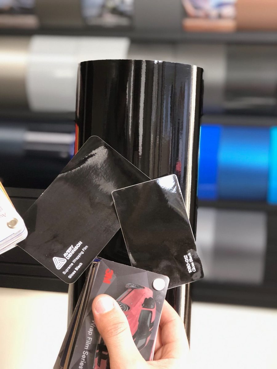
Why the swatch on the counter is lying to you
Published
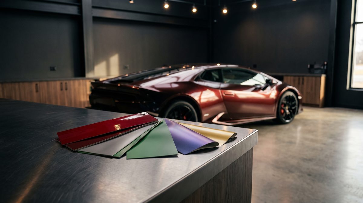
Nobody sets out to pick the wrong colour. They pick a swatch they love, sign off on it, and then see the finished car and feel something they cannot quite name.
The swatch was not wrong. It was just answering a different question.
Size changes colour
A colour spread across four square metres of bodywork reads as more saturated and usually darker than the same colour on a ten-centimetre sample. This is not an opinion about taste — it is how vision works. Large areas of a single colour push your perception further in that colour's direction.
The practical effect: mid-tone colours tend to arrive stronger than expected, and dark colours tend to arrive heavier. A grey that looked like a soft, neutral grey on the sample can land as a serious, almost architectural grey on a car.
A car is not flat
A swatch is a plane. A car is a collection of curves, creases and angles, and every one of them catches light differently.
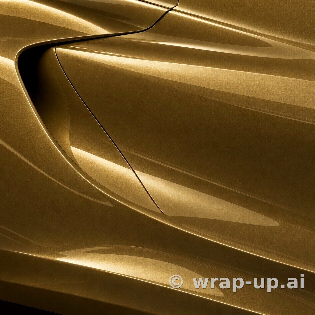
That is where the interesting films earn their money and also where they surprise people. A colourshift or iridescent finish is designed to change with viewing angle — which means the flat sample shows you exactly one of the colours it can be. The bonnet, the shoulder line and the lower door will each show you a different one.
Deep gloss finishes do something similar in reverse: they read as almost black in a recess and fully saturated on a flat panel. On a sample there are no recesses.
What is underneath still shows
Wrap vinyl is not paint. It sits on top of what is already there, and on lighter or more translucent films the base colour underneath contributes.
The same product over black, over silver and over white can land in three noticeably different places. Ask your installer what they expect on your car specifically, not on a car in general.
Shop light is not daylight
Sample folders live under fluorescent or LED lighting. Your car lives in daylight, in headlights, under sodium street lamps, in a dim car park.
Colours with a strong metallic or pearl component are the most sensitive to this. A film that glows in the showroom can go flat and grey on an overcast morning — and a film that looks unremarkable indoors can come alive in direct sun.
If you only ever see a colour under one kind of light, you have only seen part of it.
What actually helps
Three things, in order of usefulness:
- See it at car scale, on your own car. Not on a sample, not on a stock photo of someone else's model. The shape and colour of your own vehicle are half the answer.
- See it in more than one light. If you are looking at a physical sample, take it outside. Look at it in shade and in sun, and again in the evening.
- Then confirm with a physical sample. A screen cannot give you a colour match, and neither can a photograph. What it can give you is the shape of the decision, so the sample is confirming a choice rather than starting one.
Where the visualiser fits
This is the problem WrapUp AI was built for. You upload a photo of your own car, pick a real vinyl colour with its actual product number, and see that car in that colour about a minute later.
It closes the two gaps a swatch cannot: scale and shape. You see the colour across your own bodywork, with your own panel lines and your own wheels, instead of trying to imagine it from a rectangle.
It does not close the third gap, and we will not pretend otherwise. A rendered colour is an impression, not a colour match — screens differ, daylight differs, and no photograph settles a paint decision. Always check a physical sample with your installer before you order.
But by the time you are holding that sample, you should already know which colour you are checking. That is worth more than it sounds.
See your car in any wrap colour — three renders are free, no account needed to start.
See any car in any wrap colour — three renders free. Try WrapUp AI