Colors
Matte Blue Car Wrap: How Non-Reflective Blue Tones Define Vehicle Bodywork
Published
Choosing a matte blue car wrap is one of the most effective ways to emphasize the sculpted geometry of a vehicle. While blue remains one of the most versatile hues in automotive styling, removing surface gloss fundamentally changes how light moves across sheet metal. Instead of mirroring buildings, trees, and sky, a matte finish diffuses ambient light into soft, broad highlights and gradual shadows.
Within the WrapUp AI catalog, blue is the single largest family with 174 colors, while matte finishes represent 167 options across leading manufacturers. Understanding how these non-reflective blue tones perform in natural environments is the key to selecting a wrap that complements your specific car.
How Matte Finishes Change the Character of Blue
Gloss finishes rely on clear reflections to show depth. A gloss blue panel bounces sharp pinpoints of sunlight and reflects nearby scenery, which can sometimes disguise intricate character lines on modern bodywork. In contrast, a matte surface scatters incoming light in all directions.
On a car wrapped in matte blue, this diffusion creates distinct visual effects:
- Exaggerated panel transitions: Crisp creases, such as sharp shoulder lines or cowl induction hoods, display immediate contrast between the illuminated upper plane and the shaded lower plane.
- Soft specular falloff: Curved surfaces like flared fenders or rounded rooflines do not produce harsh glares. Instead, they exhibit smooth gradients that highlight the car's true volume.
- Consistent color presence: Without high-contrast reflections cluttering the panels, the blue pigment itself remains visible across a wider range of angles.
Because there is no glossy clear layer to deepen the apparent base tone, the underlying hue and saturation of the vinyl become the dominant visual factors.
Navigating the Tones: From Deep Navy to Pearlescent Shift
Not all matte blues behave the same way under open skies. The visual weight of the wrap depends heavily on lightness, saturation, and the presence of micro-metallic or pearlescent particles.
Deep and Solid Blues
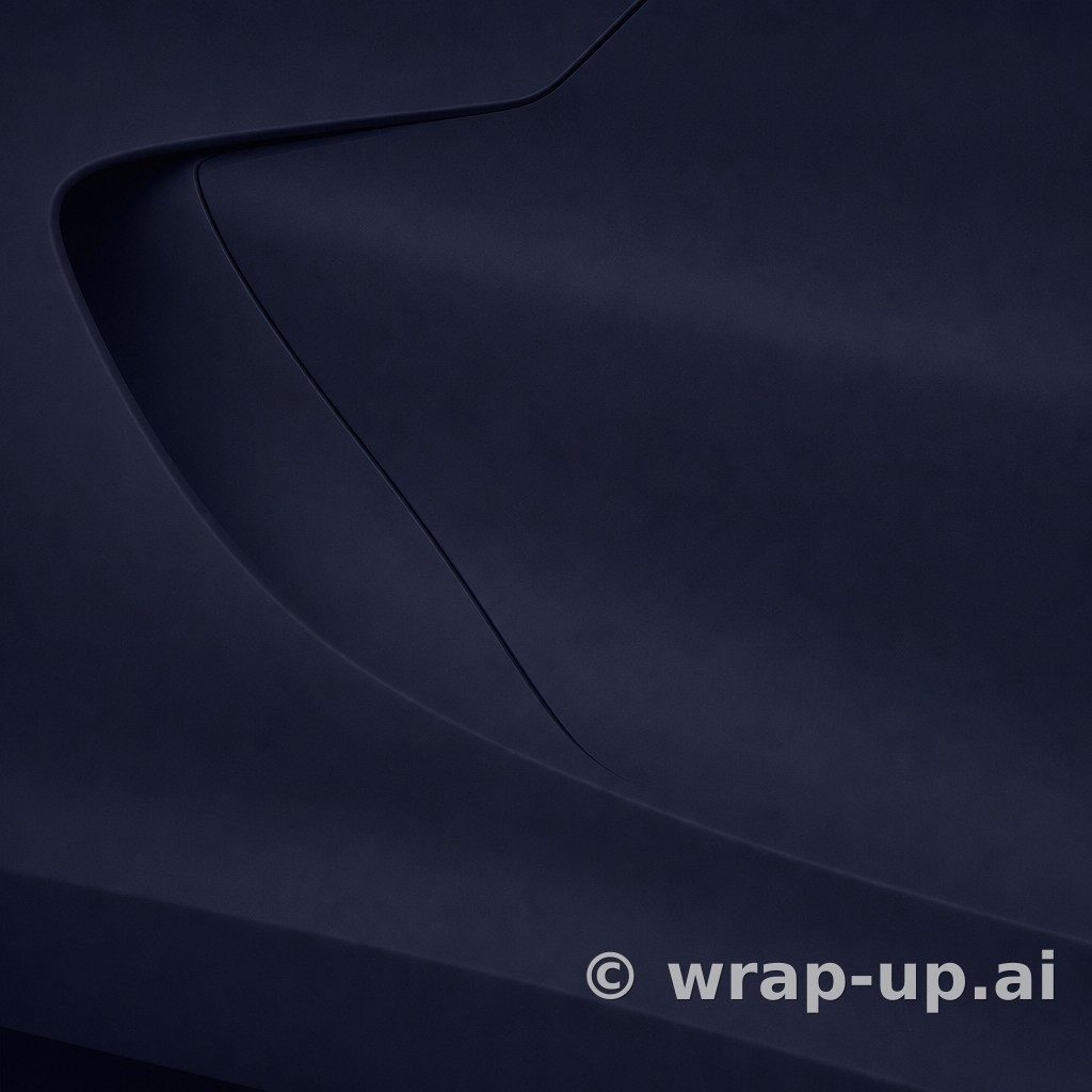
A dark, solid shade like sinister blue (K75562) by KPMF produces an understated, technical aesthetic. Darker matte blues tend to absorb significant amounts of direct light, allowing deep shadows to sit naturally in recessions around door handles, vents, and aero diffusers. On large vehicles or sedans with broad, flat surfaces, a dark matte blue keeps the silhouette grounded without feeling as monochromatic as matte black.
Frosted and Pearlescent Tones
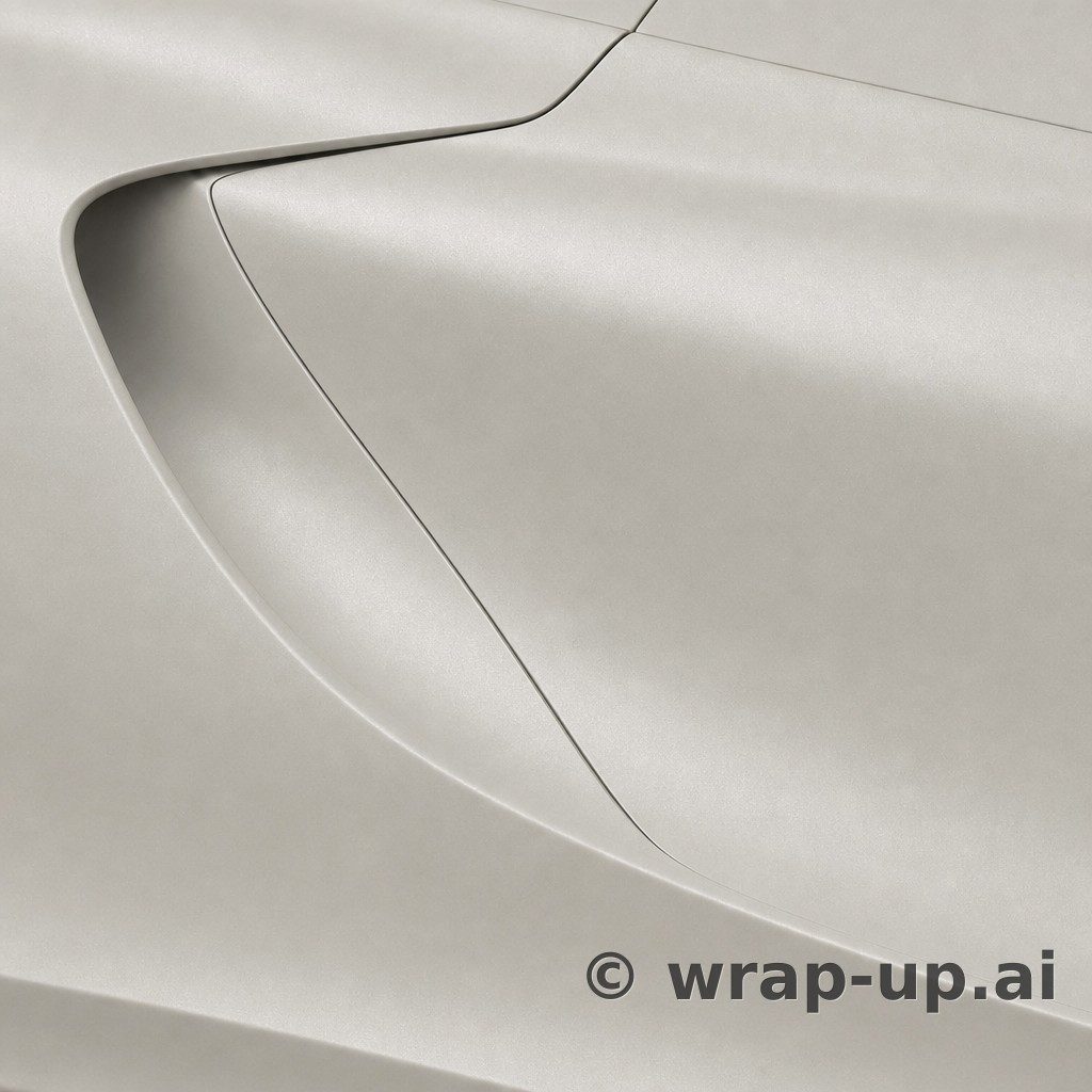
When manufacturers combine a matte top finish with pearlescent pigments, the light behavior changes once again. A color like Iced Blue Titanium (K75505) by KPMF introduces subtle metallic flake beneath the matte surface. Under overcast conditions, it reads as a calm, cool blue-gray. When hit by direct sunlight, the flake catches light through the matte layer, producing a frosted glow across upper horizontal surfaces while side panels retain a deeper blue shade.
Shifts into Teal and Violet
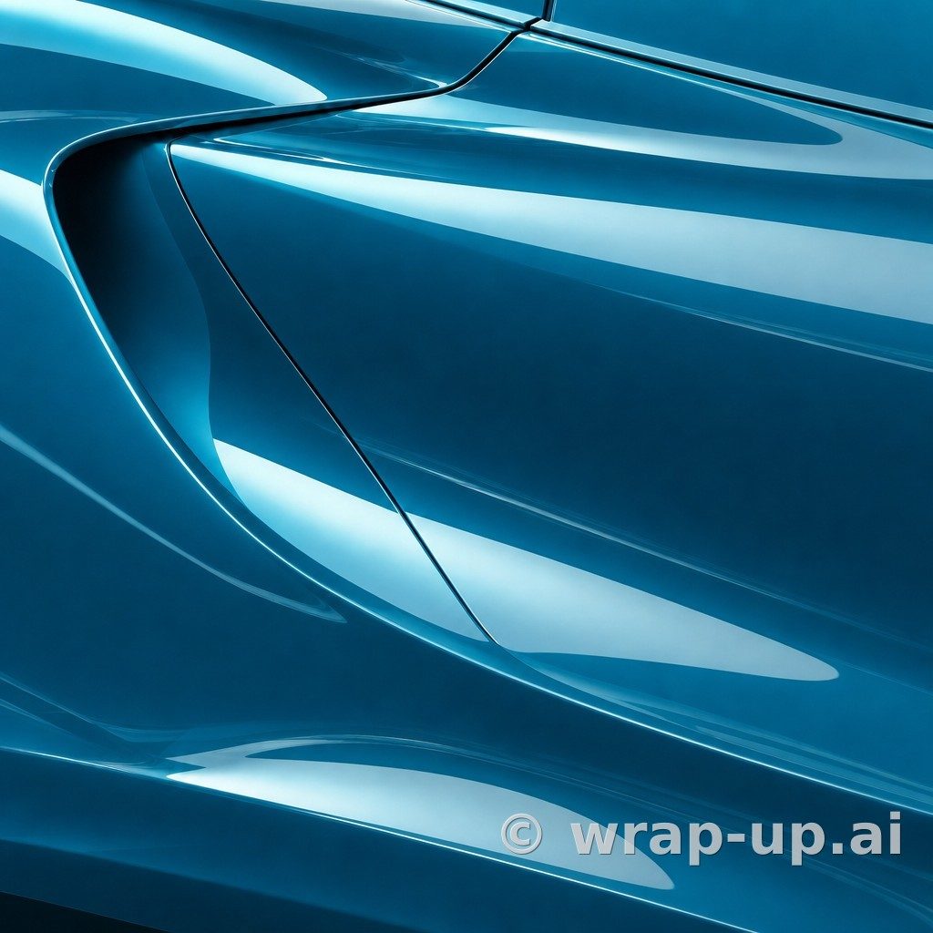
Blue also sits close to green and purple on the color spectrum, and matte films can carry distinct chromatic shifts. A shade such as Metro Stealth Dynamic Teal (K75805) by KPMF leans toward green, showing teal highlights along curvature crests under direct light. Meanwhile, a film like Purple-blue iridescent (K75566) by KPMF transitions between violet and blue depending on your viewing angle. Because the matte finish softens the color shift, the transition appears subtle and gradual across flowing fenders rather than dramatic and flashy.
Why Swatches and Photos Mislead
A common mistake when planning a wrap is relying on a small vinyl swatch held in hand or browsing photos of wrapped cars online. Neither method gives an accurate representation of how the material will look on your car.
A physical swatch measuring just a few inches across only reflects light across a single flat plane. It cannot show you how a color transitions around a curved wheel arch, how it behaves under the horizontal span of a hood, or how dark it appears in the shadow beneath a rocker panel. Furthermore, inspecting a swatch under bright indoor fluorescent lighting gives a false impression of a color that is destined to live under shifting skylight.
Looking at photos of other vehicles is equally misleading. A matte blue that looks sleek on a wide, low-slung coupe with aggressive fender flares can look flat and muted on an upright crossover with slab-sided doors. Furthermore, camera sensors, digital post-processing, and unique lighting environments at the time of the photo make it nearly impossible to evaluate true shade depth.
Visualizing the Wrap on Your Own Car
To make an informed decision, you need to evaluate the color against the actual bodywork and contours of the car you drive every day.
Using WrapUp AI, you can upload a photo of your own vehicle, pick real vinyl options from manufacturers like KPMF, Orafol, Avery, and 3M, and see how that specific shade wraps around your panels. You can observe how the diffused highlights interact with your car's distinctive lines in the environment where it actually sits. Keep in mind that a rendered color provides a visual impression rather than a microscopic color match, giving you the perspective needed to evaluate tone, contrast, and panel flow.
Three renders are free with no account needed to start. Test different shades to see whether a deep navy, a frosted titanium tone, or a dynamic teal matte blue best suits your car.
See any car in any wrap colour — three renders free. Try WrapUp AI