Colors
How bodywork lines transform deep vinyl colours
Published
Choosing a deep tone for a vehicle is rarely straightforward. On a flat panel, a dark colour can look almost black. Over an arch or along a crisp shoulder line, that same film catches the sky and shows its true hue.
Because automotive sheet metal is three-dimensional, a vinyl wrap never behaves like a single, uniform shade. It is a continuous gradient between direct highlight, soft roll-off, and deep shadow. Understanding how bodywork shapes interact with pigment and surface finish helps prevent surprises once a vehicle is wrapped.
The relationship between curvature and highlight
When light strikes a car, the shape of the metal determines how concentrated that reflection appears.
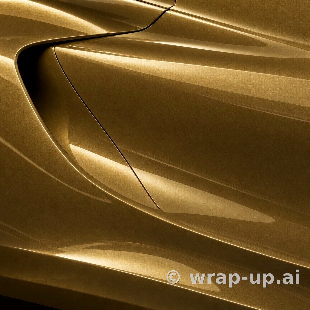
On flat, upright doors, light spreads out evenly. On a bonnet with raised strakes, a boot lid with an integrated lip, or flared rear quarters, the radius tightens. A tighter radius forces reflections into narrow, intense ribbons.
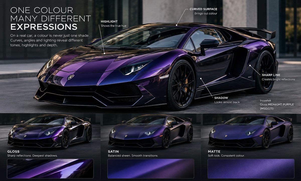
This matters for dark, saturated colours. In the catalogue of 624 colours, colour families like blue (123 colours) and purple (49 colours) contain some of the deepest tones available. Consider a shade such as Gloss MIDNIGHT PURPLE (MSG025) by Inozetek Vinyl or Deep Blue Metallic (G217) by 3M 2080. In ambient shade or over broad vertical doors, the panels absorb ambient light and appear close to black. But wherever the panel folds—along the swage line running from front wing to taillight—the pigment catches direct illumination and flares into saturated violet or rich blue.
If a car has soft, rounded styling without sharp creases, deep metallic colours will present gentle transitions. If the car has razor-sharp design lines, those lines will trace bright, saturated borders across dark surroundings.
How the finish alters perceived depth
The clear layer on top of the colour dictates how suddenly the highlight gives way to shadow.
Gloss and High Gloss
A High Gloss finish reflects light with minimal scattering. It acts like clear lacquer over paint.
- Reflections are sharp, showing distinct edges of clouds, streetlamps, or trees.
- The contrast between peak highlight and deep shadow is extreme.
- Dark shades appear at their darkest on flat areas, because ambient light passes straight into the pigment rather than scattering back to your eye.
With films like Gloss PLAYBOY AMETHYST ASH (PB101) by Inozetek Vinyl, the gloss finish creates clean contrast. The eye reads the car's shape through mirror-like reflections that travel across the panels as the vehicle moves.
Matte and Absolute Matte
Matte finishes diffuse incoming light in every direction. Instead of a narrow pinpoint reflection, the light forms a broad, soft halo over curved surfaces.
- Sharp creases appear softer because there is no sudden glare along the peak.
- Shadows are less dense, as scattered light fills in recesses.
- The core colour remains visible across more of the panel at once.
On a colour like Royal Amethyst (K75803) by KPMF in Absolute Matte, or Matte Green Blue (988M) by Orafol 970RA, the hue does not vanish into near-black shadows. The entire wing shows violet or blue-green tones, but the vehicle loses the sharp reflection lines that define panel gaps and tight styling creases.
Satin
Satin sits midway between the two. It retains enough surface sheen to hold directional light along body lines, but scatters it enough to give curved panels an even, liquid sheen. A film like Lunar Blue (S87) by 3M 2080 uses this property to show the form of complex wheel arches without creating harsh white glare spots.
Why small samples obscure panel behaviour
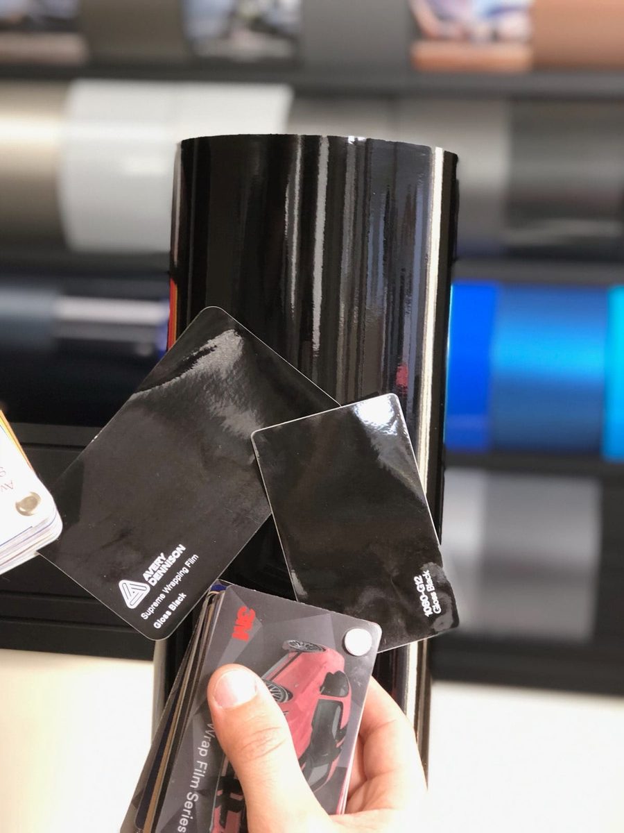
A small physical swatch card measures only a few centimetres across. Laid flat under indoor lighting, it gives almost no indication of how a colour behaves over a curved wing or a bonnet bulge.
A flat swatch shows you only one point on the light curve: usually the ambient midtone. It cannot show you:
- How the colour falls off into shadow along the lower sills.
- How sharp the highlight appears along a swage line.
- How the colour contrasts against black window trims and glass.
This is why seeing a digital impression across the actual lines of your car is an essential step before committing to rolls of vinyl. A rendered colour is an impression, not a colour match, but it reveals where the shadows will gather and where the highlights will flash across your car's specific shape.
Testing colours against your vehicle's lines
Before picking a shade, look at your car from three-quarter angles. Notice where your eye naturally traces the styling. If your vehicle relies on crisp folds to look balanced, a finish with higher reflection will accentuate those lines. If the car has muscular, rounded forms, a satin or matte finish can emphasise the volume of the panels rather than the environment around them.
To see how different finishes and deep shades respond to your own car's bodywork, test them in WrapUp AI.
See any car in any wrap colour — three renders free. Try WrapUp AI